Facebook. After the Paris attacks, friends' 'temporary profile pictures' are now automatically reverting, dropping the Tricolore overlay placed in memory of 137 French dead.
Perhaps the world has moved on.
Now, there are times in life when design leaps out at you and you think "Woah. That's good." The arrow tucked into FedEx. The conductor in the LSO logo. 'Marks & Spencer' using 'Magic & Sparkle' (even the same number of letters) at Christmas.
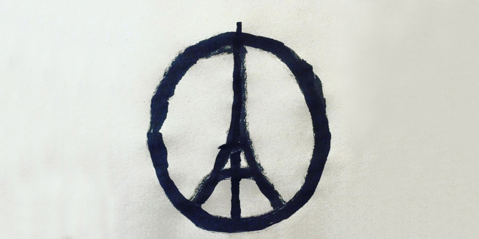
More recently, and far more poignantly, in the last few weeks I have been drawn again and again to something created by a man called Jean Jullien. A Frenchman, living in London, on 13th November he drew the internationally recognisable peace symbol, but with an extra stroke. That single, extra, horizontal line immediately evoked the Eiffel Tower and every time, its simple brilliance strikes me. It isn't trying to sell anything, it isn't contrived, but it is undeniably moving.
And I'm not alone in liking it. First tweeted with the words "Peace for Paris", it has now had 59.8k retweets, a further 78k from a Banksy tribute account, and multiple thousands more from people identifying and sympathising with it. It's been hand painted on cards left with flowers around Paris, held up on placards, chalked on the floor of Manhattan, illuminated with candles in Kathmandu, and worn on T-shirts the world over.
Of course the world has moved on, it must. It literally can't go backwards. But that doesn't mean it must forget Iraq, Nigeria, Kenya, Lebanon.
And France. Paris, for which one simple swipe of paint will act as a symbol of remembrance for all time.
Here's to peace.