
Ta Da!
We have rebranded! What do you think? Do you like it?
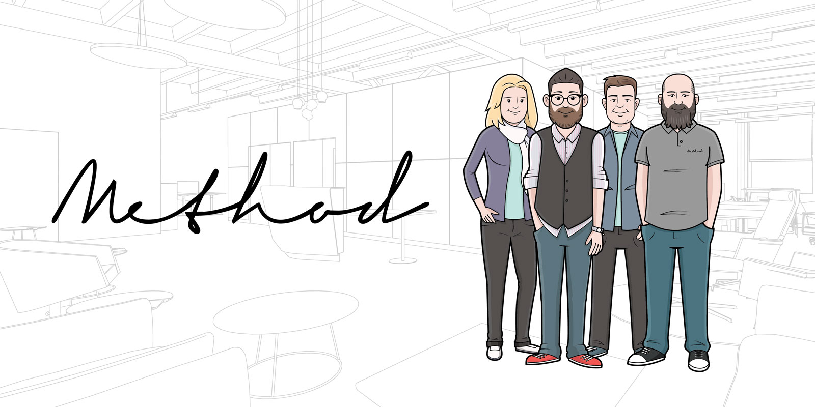
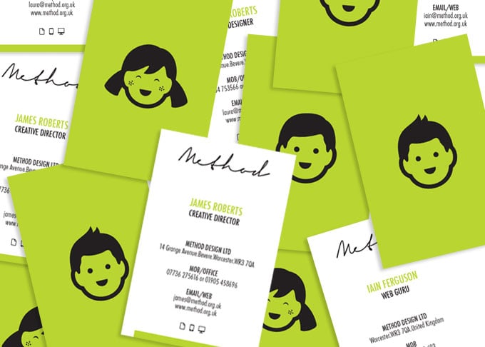
Method Design has rebranded, with new designs featuring an updated written logo and cool illustrated people. Our signature green has remained as our "something old!"
The new identity aims to add a fun element to design, after all, design is fun right? We also wanted to create a look and feel that works well across all digital platforms and print materials. The little illustrated people reflect the core team who work at Method HQ. A fun cartoon style icon depicting our staff - once you have met us, we are pretty sure you'll agree!
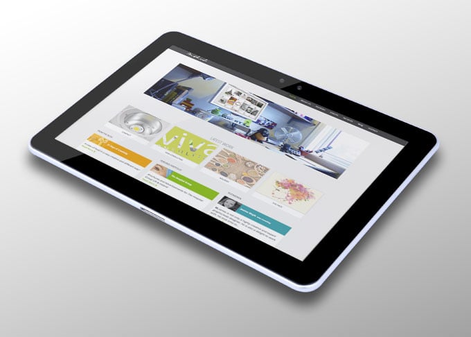
Our new website is user friendly on several platforms and is updated to give great definition on retina display screens. It was really important to us to make sure we are visible on any device, especially iPads and smart phones, as this is becoming the norm for searches.
Check out some of the new branding below...


Stay Ahead with Method
Join our community of forward-thinking professionals. Subscribe to receive the latest insights on marketing, design, and innovation directly to your inbox.