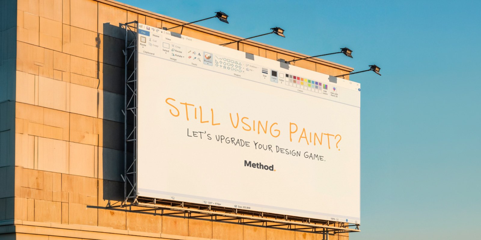
Buy a house and people will start talking at you about "lintels". Get a second-hand Rover 200 and friends will queue up to kick your tyres, banging on about "axles". We all like to pretend we wrote the Wikipedia page on the day's red hot topic, and jargon sells it. In graphic design it's: “above the fold".
For the uninitiated, picture a newspaper stand. Maximising the number of titles on display, the papers are all in half, with only the top half blaring out at you. In other words, you can only see what's "above the fold".
That has always put content in that top zone at a premium. Adverts, headlines, key information, all clamour to be above the fold. And in print, it still does.
But what about online. Unless you're the generation that likes to print web pages and read them in an armchair, where's my fold?
When designers first started designing for the web, familiar terminology from the print world simply carried over. The 'fold' was a known and loved reference point, and on a website became the bottom of the screen.
But of course, it isn't quite as simple as that. We don't all use the same computer. Putting a 'Join today!' link 590 pixels down might work beautifully on the family desktop, but won't even peek into view on your phone. Worse still, it might only be any good for just 1 in 10 of your visitors.
It turns out that cramming all of your hierarchically most treasured info at the top of the page isn't a guarantee of success. Research shows instead that it's fonts, breathing space and clarity we find persuasive. Forget the fold, it's good copy, a quality layout and an arresting first impression that win out.
In other words: good graphic design. So the time has come to abandon "above the fold" in digital media. It's gone the way of the dodo, dial-up and Rover.