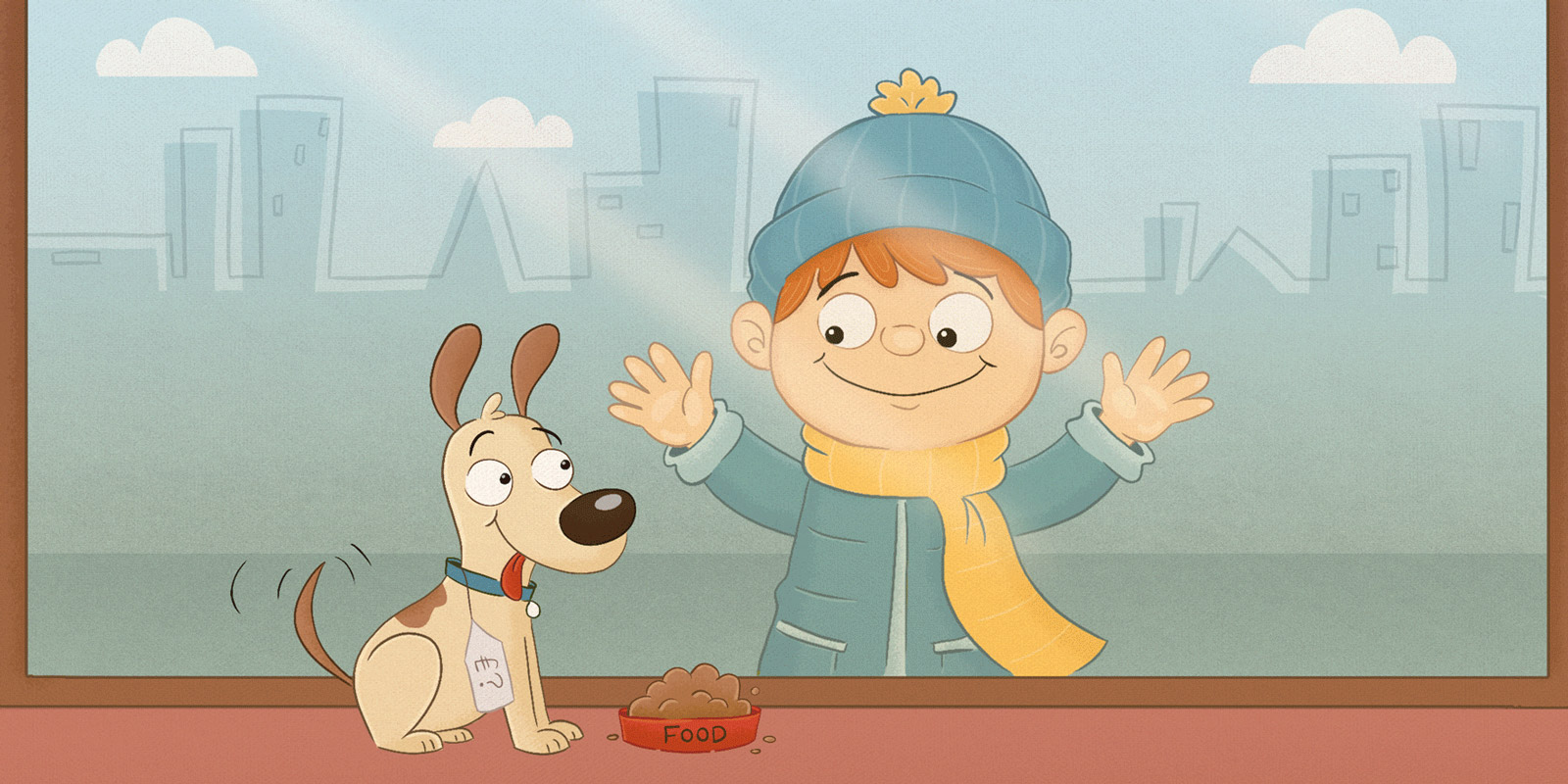
People often ask us “How much is a website then?” The short answer is “£200-20,000”.
“Wow, that's a wide bracket!” It is, and it makes sense when you know why.
Buying a website is a little like buying a house. If you’re looking to live alone, then a bijou 1-bed flat might be the answer. A family of 6 however, might be after just a few more bedrooms. To say nothing of whether you want a garage, large garden, or en-suite bathroom. Will you stay in Worcestershire, and is it worth spending a little extra for a detached house, given drum practice.
So too with a website, there are a lot of things to decide on, which affect the price. Simply put: how big it is varies the time it takes to build, and in turn the cost. But quite a lot has to happen before the ‘building’ even starts. We need to consider:
- Who’s writing the content: are you happy to or should we write the text?
- Will you need an online shop?
- Will you want to be able to make changes to it or upload news?
- Do you have photographs and logos already, or do we need to create them?
- Are you hoping to build traffic to your site, from search engines?
- Do you have any key goals for the website, like new customers signing up or visiting a particular page?
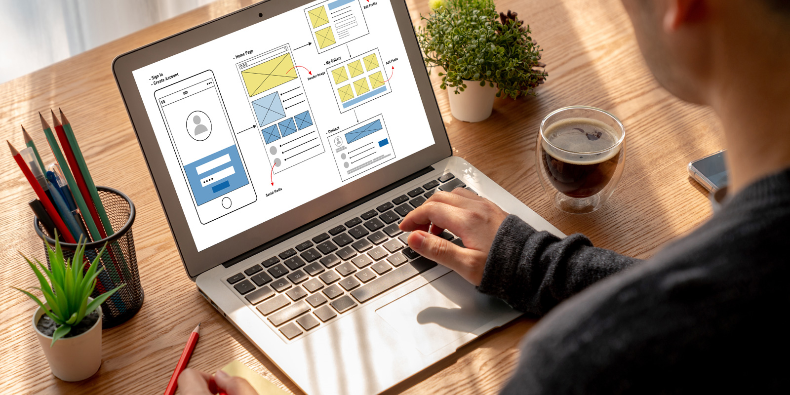
As with hiring an architect, the first stage of creating a website is this thoughtful process of enquiry. We have to find out what you need, and then plan a structure that serves that need. If you want to sell more T-shirts, we’ll lead the eye to the smart ‘buy this T-shirt’ button. If you only need to get a potential customer on the phone to prove how brilliant your service is, we’ll draw the user’s eye to contact information. Get those the wrong way round and people who want a T-shirt will forever be pestering Janice on reception.
After this research, we can apply our findings to the interface design. But even once the website is built, the research shouldn’t stop. We keep a close eye on analytics, which are nuggets of code that track how visitors interact with your site by recording what they click: revealing whether the structure is working. All in all, there’s a lot more back-office work than you might at first think. A professional UX designer doesn’t just paint pixels, they enhance user-satisfaction by improving the usability, accessibility, and pleasure provided to people on your site. It’s an investment that ensures your website works for you.
In the building trade, bricks, mortar and steel are the result of hundreds of years of experience. In web design, the process may be newer but should be no less thorough. Your domain is your empty plot of soil. A flat-pack site that looks pretty but has no customised user-experience underpinning it, may fail you; like the foolish man who built his website on the sand. Firm foundations can only come with professional User Interface and User Experience design.
Be as proud of your new online home as a dog with a bone. Get a professional website designed and built by Method Design.


