A recent study by business advisory firm Deloitte has shown that 81% of adults have gained access to a smartphone and 89% had recently used the internet.
“So what!” you may say; well, in the year 2000 only 25% of adults in the UK had access to the internet and 36% had a ‘dumb’ mobile phone.
The phone has become an ever present extension of our body and is widely used to access information on the go as we seek answers to product selection, general knowledge and solutions to problems we might encounter. The first contact made with any company is likely to be through its webpage on a small screened device.
The important point to note is that more web pages are now being accessed via smartphones rather than desktop devices. In order to fully capitalise on this shift towards smaller screens, It’s highly important that you and your business are presented with an interface that is easily usable on mobile devices.
There is nothing more frustrating than loading a web page that isn’t mobile ready, is clumsily unintuitive, messy in layout and difficult to navigate. More often than not the poor user experience results in navigation away from the offending page to search elsewhere for the information. An opportunity has been lost!
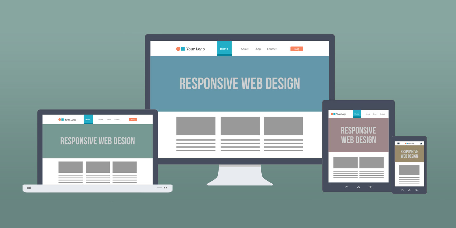
Conscious of this wide array of screen-sizes and the impact they can have on the user, we at Method Design utilise “responsive design” which reorganises your site to make it user friendly for each device and screen size.
Responsive design intuitively changes your website layout to best suit the screen size upon which it is being viewed. It transitions automatically and seamlessly, whilst retaining all the original content, making it user friendly and increasing the potential of the viewer becoming a client.


