Responsive web design is a lower cost alternative to building multiple device-specific websites.
The mobile is here to stay. Searches on mobile devices are set to surpass desktop by 2015 at the latest, so only targeting desktop machines could be losing you money!
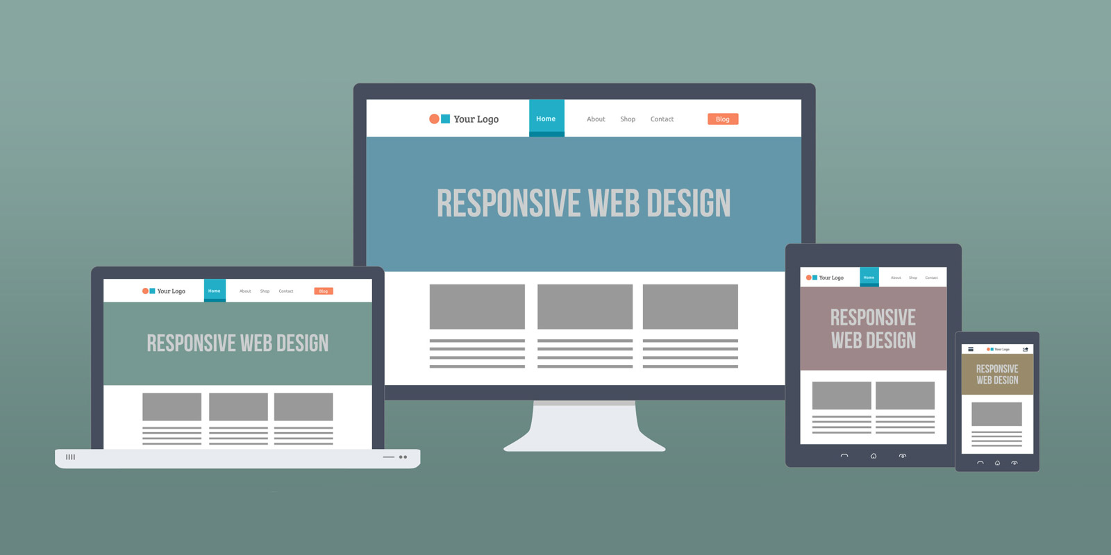
Everybody now wants a mobile version of their website (and why wouldn't they, desktop computers are becoming more redundant day-by-day). We could design a range of different websites, one to work on Blackberry, another to work on an iPad, then Kindle, and not forgetting the Netbook. Not only that, all screen resolutions must be compatible too. But, there is a better way... Responsive web design.
In a nut shell, a responsive website changes its content and design layout based on the size of the user's screen.
Behind the pretty fluid design exterior the website is coded using percentages rather than fixed pixels to allow the whole website to move and re-adjust as the screen size does.
Our very own website has been built using this clever system, so test it out by dragging the corner of your browser window to see the design change. Sorry to all those who are viewing/reading this on an iPhone or tablet, we have already done the hard work for you! :) - clever isn't it!


