
Not got time to read? Listen instead with our audio version
Typography is more than just picking a pretty font, it’s a design powerhouse that shapes readability, visual impact, and brand perception. The right font choice clarifies your message, while the wrong one can create confusion and disengagement.
Whether you're designing a website, a brand identity, or printed material, understanding typography will help you make informed and intentional choices.
In this guide, we’ll break down the essentials of font selection so you can create a cohesive, polished, and effective design.
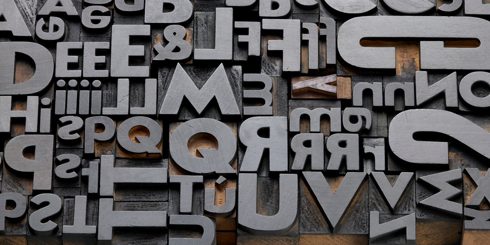
Understanding typography: Typeface vs font
Before exploring font selection, let’s clear up a common misconception. People often use “typeface” and “font” interchangeably, but they’re not the same thing:
- Typeface: A family of fonts with a shared design, such as Garamond or Helvetica.
- Font: A specific version of a typeface, like Helvetica Bold or Garamond Italic.
Typography plays a crucial role in guiding the reader’s experience. As MasterClass puts it, “good typography ensures that the reader’s eyes flow smoothly across the text without strain.” Keeping this in mind, let’s explore the different types of fonts and how to use them effectively.
Types of fonts and their best uses
Not all fonts serve the same purpose. Here’s a breakdown of the main font categories and where they shine:
- Serif fonts
Serif fonts feature small decorative strokes (serifs) at the ends of letters. They exude tradition, professionalism, and credibility, making them ideal for books, newspapers, and formal documents.Best for: Law firms, publishers, academic institutions, luxury brands.
Examples: Times New Roman, Garamond, Georgia. -
Sans-serif fonts
Sans-serif fonts lack decorative strokes, giving them a clean and modern look. They’re widely used in digital design due to their clarity on screens.Best for: Tech companies, startups, contemporary brands.
Examples: Helvetica, Arial, Futura.
- Script & decorative fonts
Script fonts mimic handwriting and add elegance or creativity, while decorative fonts are stylised to make a bold statement. These fonts should be used sparingly, as they can be hard to read in large blocks of text.
Best for: Luxury brands, wedding invitations, creative industries.
Examples: Lobster, Pacifico, Brush Script.
Matching fonts to your brand identity
Fonts should align with your brand’s personality and values. Ask yourself:
- Do I want to appear modern and approachable? → Go for a sans-serif font.
- Do I want to convey tradition and trust? → Choose a serif font.
- Do I want something bold and unique? → Consider a script or decorative font.
By selecting fonts that match your brand’s tone, you create a strong and consistent identity across all platforms.
Prioritising readability
A font can be beautiful, but if it’s hard to read, it’s ineffective.
Here’s how to ensure your typography is user-friendly:
Font size: A minimum of 16px is ideal for body text on digital platforms.
Spacing & kerning: Proper letter spacing and line height improve clarity.
Contrast: Ensure text stands out against the background to prevent strain.
If you’re designing for web or mobile, always test your fonts on different screen sizes to ensure legibility.
Font pairing: Creating visual harmony
Most designs require a mix of fonts for hierarchy and contrast. Follow these best practices for font pairing:
Contrast is key: Pair a serif font with a sans-serif font to create balance.
Limit variety: Stick to two or three fonts to avoid a cluttered look.
Maintain consistency: Your fonts should feel cohesive, not mismatched.
Successful font pairing is about finding balance, opposing fonts should complement, not compete.
Testing fonts across different mediums
A font that looks perfect in print may not translate well to digital formats, and vice versa. Always test your fonts in different contexts, such as:
Websites and mobile apps, Printed materials (brochures, business cards), Social media graphics and advertisements
If a font appears too thin, distorted, or unreadable, reconsider your choice. As MasterClass suggests, “evaluate how a font behaves in different layouts before finalising your choice.”
Final Thoughts
Choosing the right typography is about striking the perfect balance between aesthetics, readability, and functionality. By understanding different font styles, aligning them with your brand, prioritising legibility, and testing across various mediums, you can create designs that are both visually compelling and easy to read.
Typography is an essential tool for storytelling and brand identity. Whether you’re working on digital or print designs, making thoughtful font choices will ensure your message is clear and professional.
Are you looking for graphic design and branding for your UK business? Method is available to help you establish your business with show stopping branding or refresh your current branding. Get in touch today.


Stay Ahead with Method
Join our community of forward-thinking professionals. Subscribe to receive the latest insights on marketing, design, and innovation directly to your inbox.