
Victoria approached us with an idea for her new independent jewellers and gift shop, PepperPot. Over a few cups of tea, we started sharing ideas and rough sketches over the table.
Once the initial ideas were drawn up and a clear vision of where the shop's identity should be heading, we quickly got to work on collection of design examples.
This new brand needed to be simple, eye-catching and different, we wanted to create something that she loved and would be proud of, but also something that was true to the shop, and the vision.
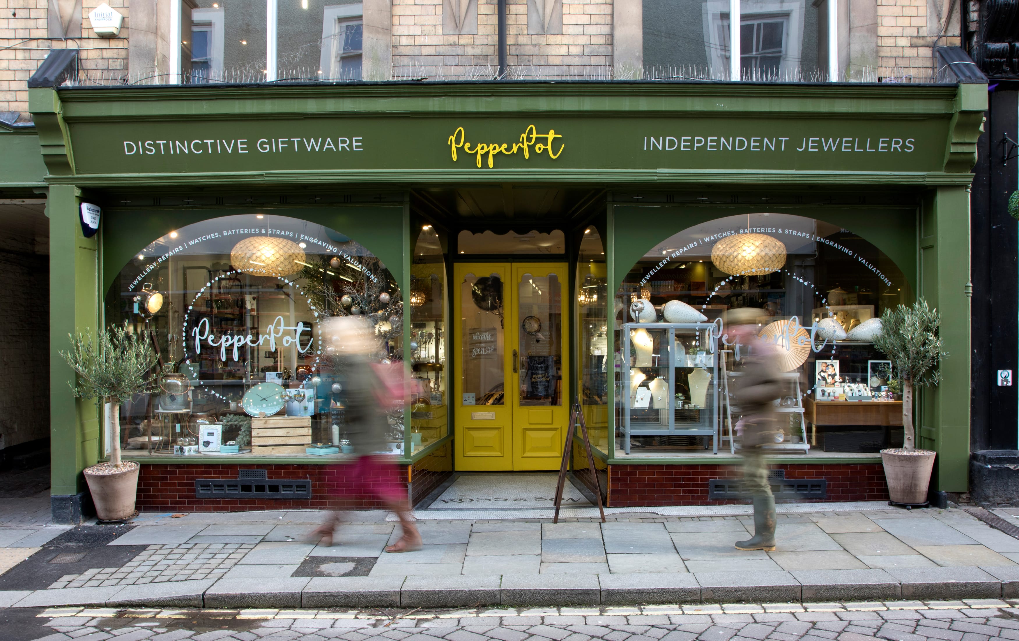
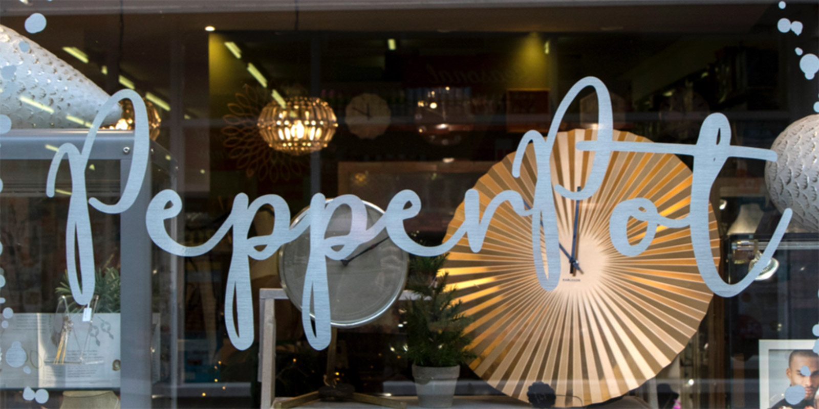
The final colour palette of yellow, olive and grey gives a classic but modern feel and provides the shop front with a distinctive look that stands out on Leominster's High Street. Window signage is subtle but also attractive which shows off the brand but doesn’t distract from the window displays.
As part of the brand we also created stationery, business cards, gift vouchers and social graphics so everywhere that PepperPot is viewed is constant and compliment’s the shop.
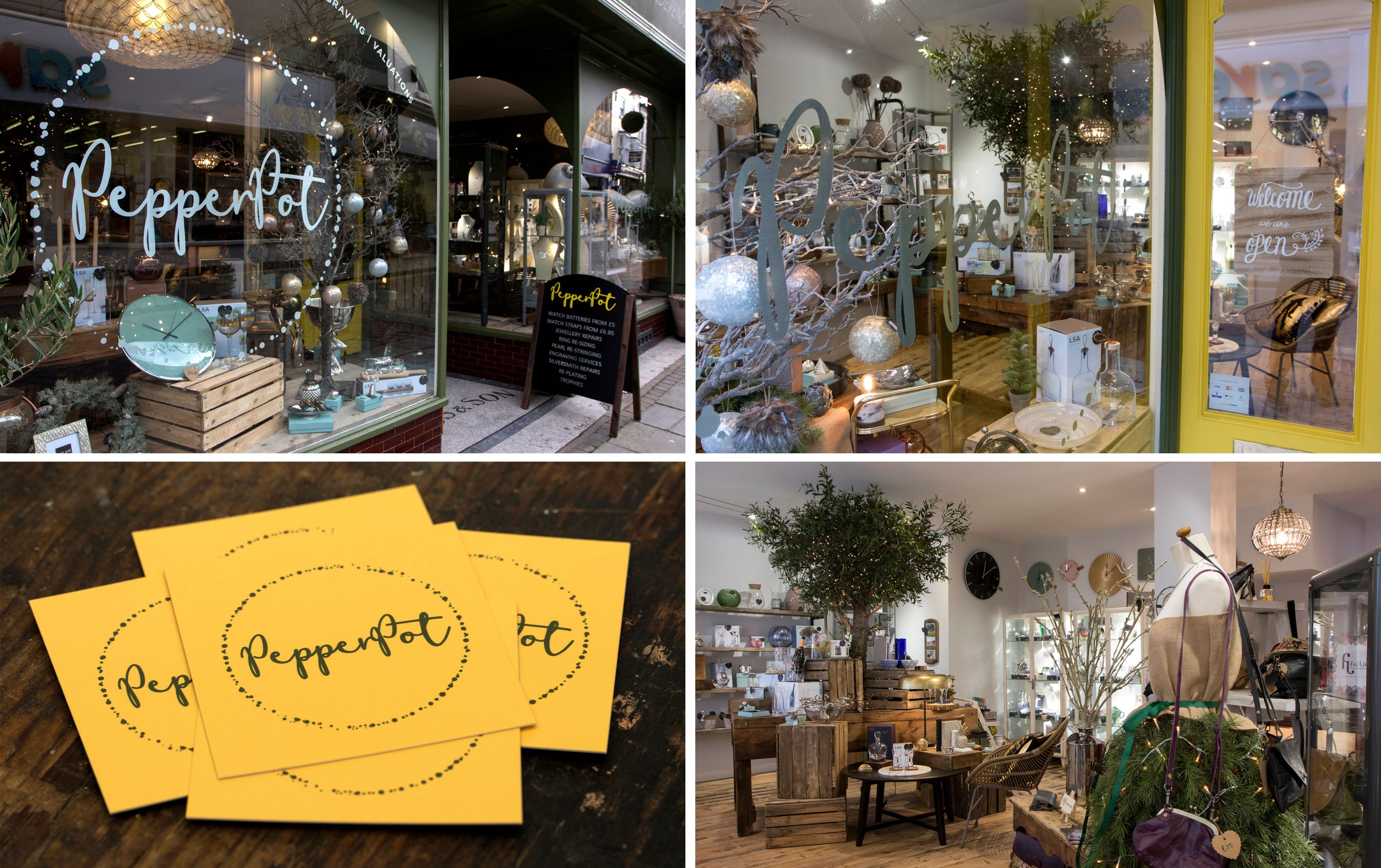
Victoria has fed back that people are always commenting on how fabulous the shop looks and while Paul was photographing the store, several people outside commented on it’s excellent appearance and customers were equally impressed. This feedback is great to hear and also lovely to listen to Victoria say how proud she is of her shop and the way it looks.
As designers we solve problems, finding the right path and direction that a product or brand should take and look is one of our essential skills, when we get such fantastic feedback from not only the client but the public for a job well done, it's a tremendous feeling!


Stay Ahead with Method
Join our community of forward-thinking professionals. Subscribe to receive the latest insights on marketing, design, and innovation directly to your inbox.