
If you Google ‘colour psychology’, you might be forgiven for thinking that a druid from Watford has been allowed near Science again. And yet, delve a little further, and it really isn’t so bizarre.
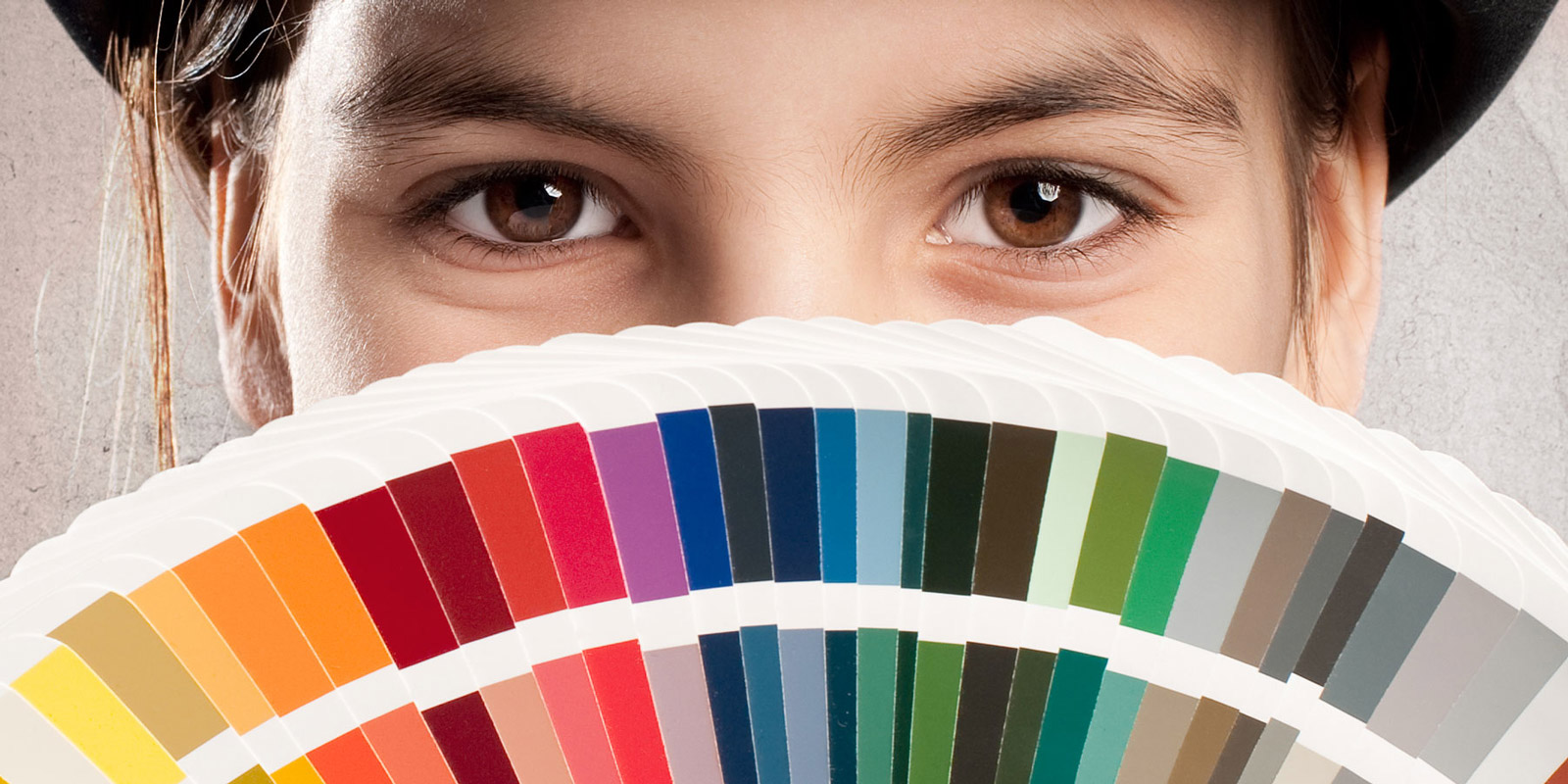
‘Colour psychology’ is the study of how colour impacts us: our thoughts, feelings, tastes and choices. If you’ve ever been stung by a wasp you’ll appreciate why a hazard sign might be yellow and black. Stopping at a traffic light makes a lot more sense when you know that red is the colour that grabs us most.
Just because we may only consciously think about colours when choosing a new bathroom suite, doesn’t mean we don’t have in-built reactions all the time. Which makes colour incredibly powerful in the design world. It’s the best non-verbal way to communicate. It can affect how we feel about a company – and even our buying habits. Logos are the most obvious example of this. It isn’t accidental that Boots’ branding is blue. It’s a hue many find trustworthy and soothing. Oxfam and Greenpeace wouldn’t quite look right in purple; green carries ideas of nature and care. McDonald’s mixing red and yellow cross-pollinates feelings of youth, playfulness and happiness.
If this sounds like boardroom mumbo jumbo, then discovering that red even has the power to make some people feel hungry, might persuade you otherwise.
Of course, colour is a very personal thing. And ‘brand personality’ a minefield you may not wish to cross. That’s where Method come in.
Getting to know your company, your ethos and your product means we can create not just branding, but entire marketing materials that accurately reflect you. We can incorporate our understanding of colour psychology to save you trawling through journals or talking to druids. That way your message gets across professionally and always hits the mark.


Stay Ahead with Method
Join our community of forward-thinking professionals. Subscribe to receive the latest insights on marketing, design, and innovation directly to your inbox.